
Edit 03, The red register
Three ways to wear red without looking like a racing team.
Red is difficult on the bike. Too much and it starts to look like a team jersey; too little and it disappears into another black kit. The interesting versions sit around the edges: prune with olive sleeves, burgundy that looks almost brown in shade, and a proper red that needs a cool counterweight.
I wanted three outfits that treat red as a colour to dress with, not a signal. The first is soft and slightly unusual, the second almost tonal, and the third uses contrast instead of restraint. None needs a matching team kit to make sense.
Look 01 of 3, Prune / Graphite
Purple with an olive edge, grounded by dark grey.
The olive sleeves stop the prune jersey from becoming one uninterrupted block of colour. Graphite bibs cool the palette down, while charcoal socks keep the ankle quiet.
Credits
Isadore, Signature Jersey, Prune Purple / Dark Olive
The olive sleeves make the prune colour less obvious and more interesting.
JerseyUS$105, few leftView →, Isadore Signature Jersey, Prune Purple / Dark Olive, opens in a new tab

Albion, Men's ABR1 Pocket Bib Shorts, Graphite
Graphite is softer than black and sits well beside the olive sleeves.
Bib shorts€230, few leftView →, Albion Men's ABR1 Pocket Bib Shorts, Graphite, opens in a new tab

Albion, Merino Socks, Charcoal
The charcoal is nearly black, with just a little orange at the toe.
Socks£25View →, Albion Merino Socks, Charcoal, opens in a new tab

Look 02 of 3, Burgundy / Andora
Two reds that work because they are not quite the same.
The jersey is a dusty, slightly purple burgundy; the bibs are darker and browner. That difference keeps the outfit from looking like a matching set. I would finish it with black socks rather than add white.
Credits
MAAP, Alt_Road Jersey, Burgundy
Its dusty finish is much easier to pair than a bright, flat burgundy.
JerseyUS$80View →, MAAP Alt_Road Jersey, Burgundy, opens in a new tab

Isadore, Debut Bib Shorts, Andora
The darker wine colour gives the jersey a base without turning everything black.
Bib shorts€130View →, Isadore Debut Bib Shorts, Andora, opens in a new tab
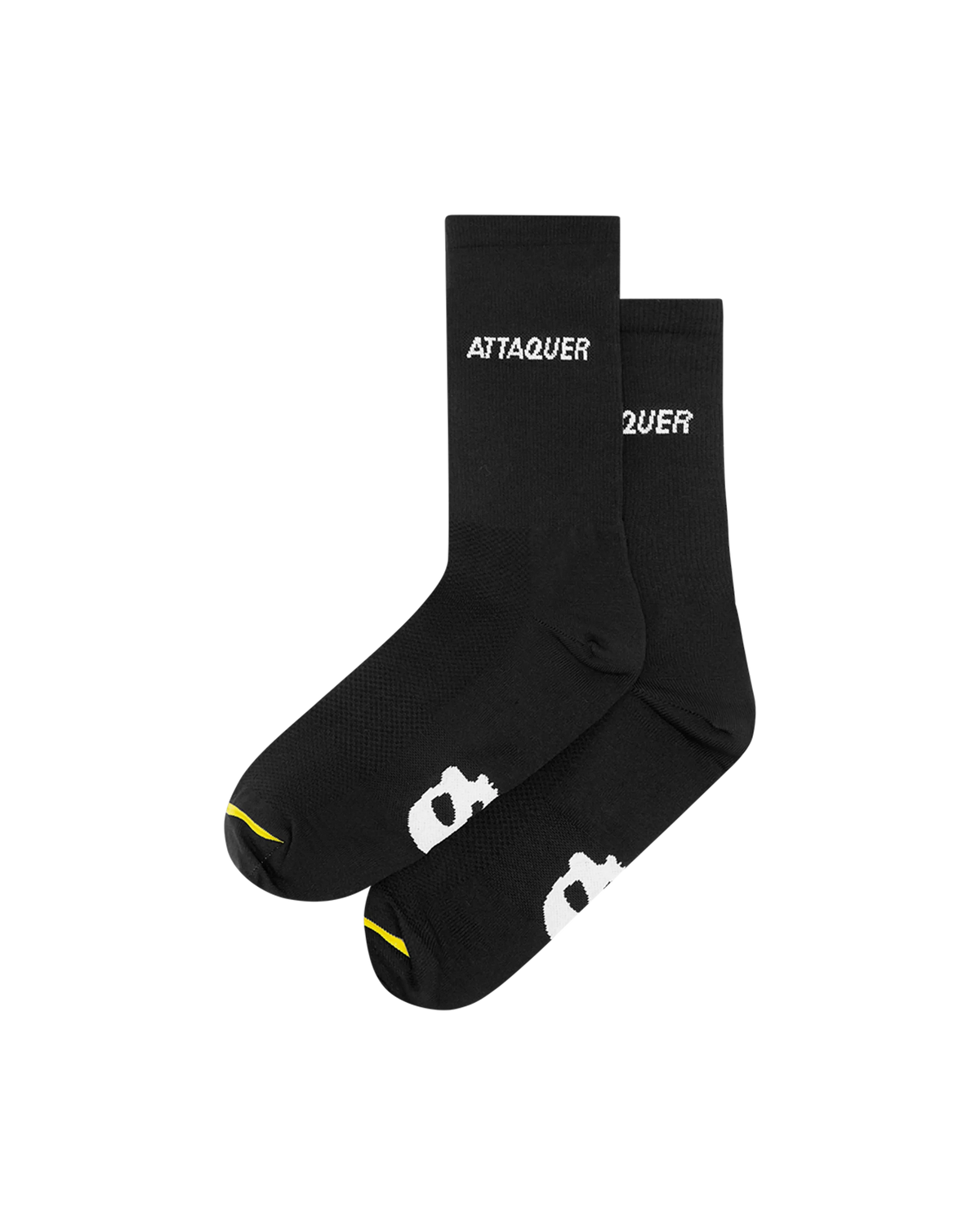
Attaquer, All Day Side Logo Socks, Black
Black finishes the outfit without introducing another large block of colour.
SocksA$30View →, Attaquer All Day Side Logo Socks, Black, opens in a new tab
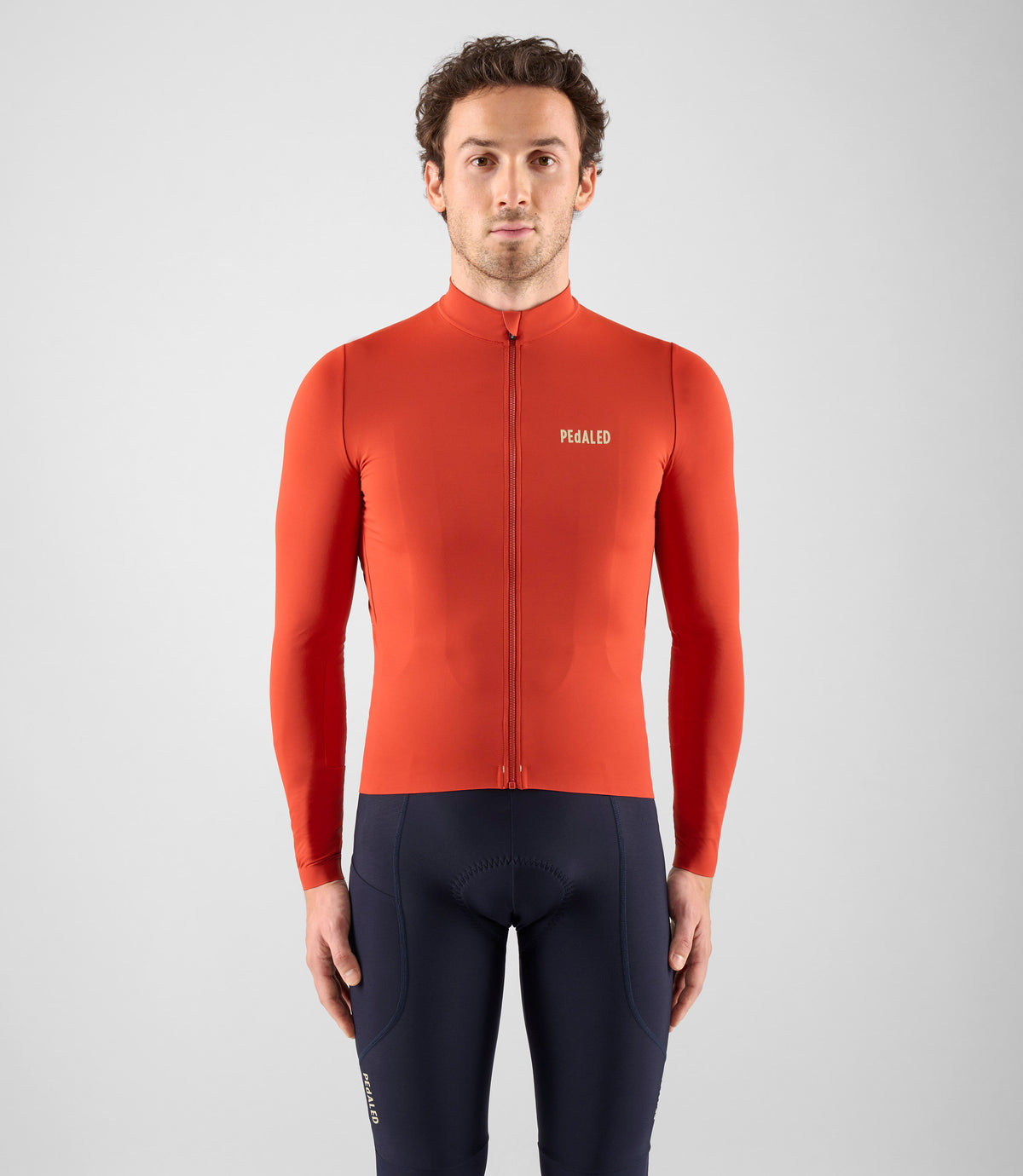
Look 03 of 3, Red / Steel
A warmer red against a cooler, blue-grey bib.
This is the one that takes a risk. The long-sleeved red is clear and strong, but the steel-blue bibs change its character completely. The socks stay black because another colour would be too much.
Credits
PEdALED, Element Long-Sleeve Jersey, Red
The clean front and long sleeves give a strong red room to work.
JerseyUS$195View →, PEdALED Element Long-Sleeve Jersey, Red, opens in a new tab
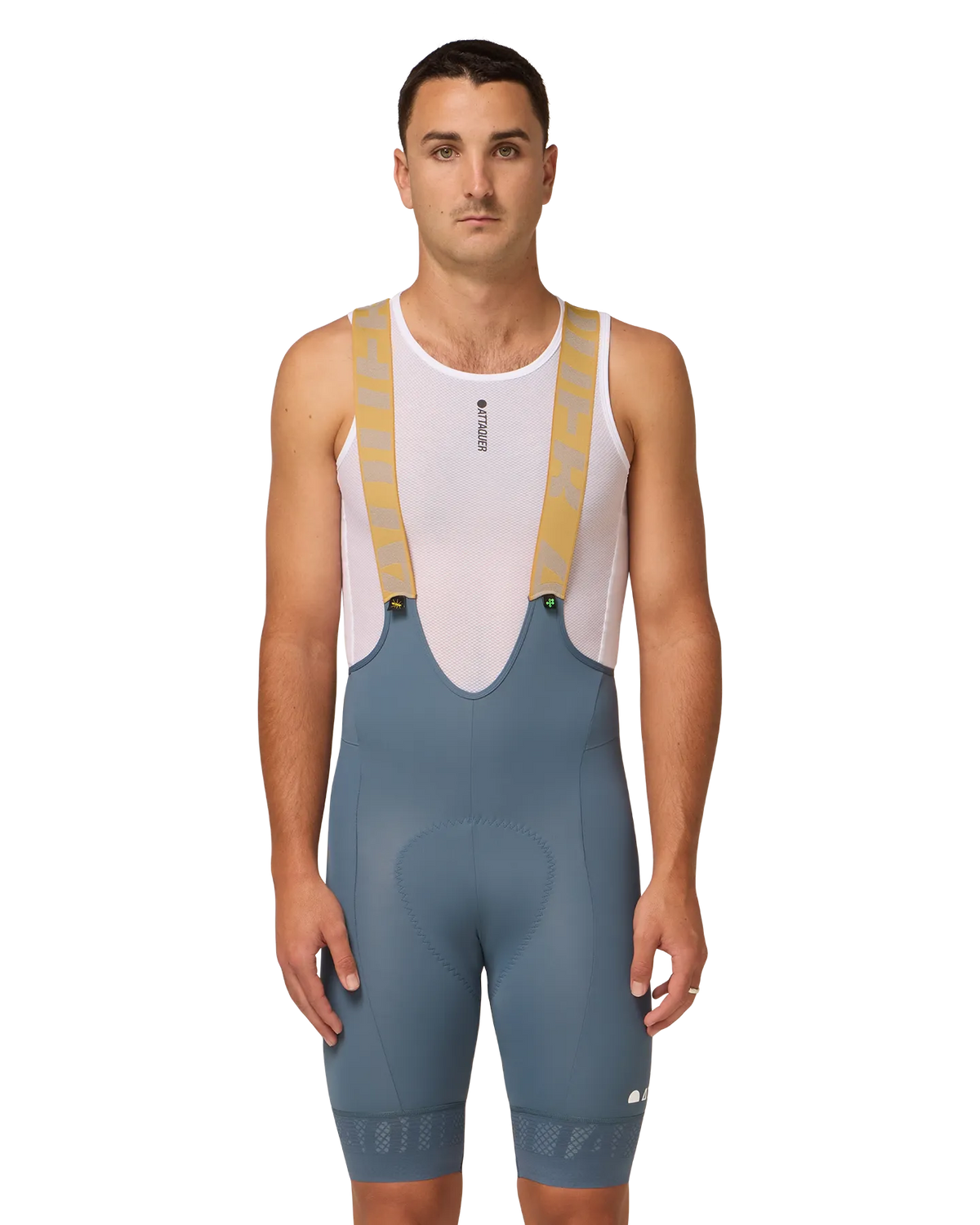
Attaquer, All Day Bib Short, Steel
Steel blue is a better counterpoint to this red than another black bib.
Bib shortsA$360, few leftView →, Attaquer All Day Bib Short, Steel, opens in a new tab
Attaquer, All Day Side Logo Socks, Black
Black finishes the outfit without introducing another large block of colour.
SocksA$30View →, Attaquer All Day Side Logo Socks, Black, opens in a new tab